Typography influences far more than aesthetics. The fonts used on a website affect readability, user experience, brand perception, and even conversion rates. While visitors may not consciously evaluate font choices, typography shapes how easily information is consumed, how professional a business appears, and ultimately whether a user takes action. In a digital landscape where attention spans are razor-thin, the right typographic decisions can mean the difference between a bounced visitor and a loyal customer.
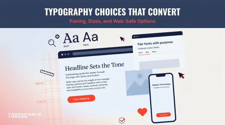
Effective typography guides users through content while reinforcing a brand’s identity. It establishes hierarchy, sets the tone, and creates a seamless reading experience across devices. Choosing the right fonts, sizes, and combinations isn’t merely a design exercise—it’s a strategic business move that can lift engagement and make important messages impossible to ignore.
Typography directly affects how quickly users process information. When text is difficult to read—whether because of a tiny font, poor contrast, or overly decorative letterforms—the brain works harder. That cognitive friction increases bounce rates and reduces the likelihood that a visitor will absorb your message. Clear, well-organized typography, on the other hand, allows users to scan, find what they need, and move smoothly toward a conversion goal.
Trust is another quiet benefit. Professional, consistent font choices project competence. A site slathered in Comic Sans or clashing typefaces signals amateurism, while a restrained, harmonious typographic palette evokes stability and credibility. In fact, a Stanford study on web credibility found that design elements, including typography, were among the top factors users employed to assess trustworthiness. Good type doesn’t just look nice—it reassures users that the business behind the screen is legitimate and detail-oriented.
Font pairing is the art of combining two or more typefaces that work in harmony. Most websites use one font for headings and another for body text, creating a clear visual hierarchy that helps users distinguish between sections, topics, and actions. When done well, pairing elevates the entire design; when done poorly, it creates visual chaos.
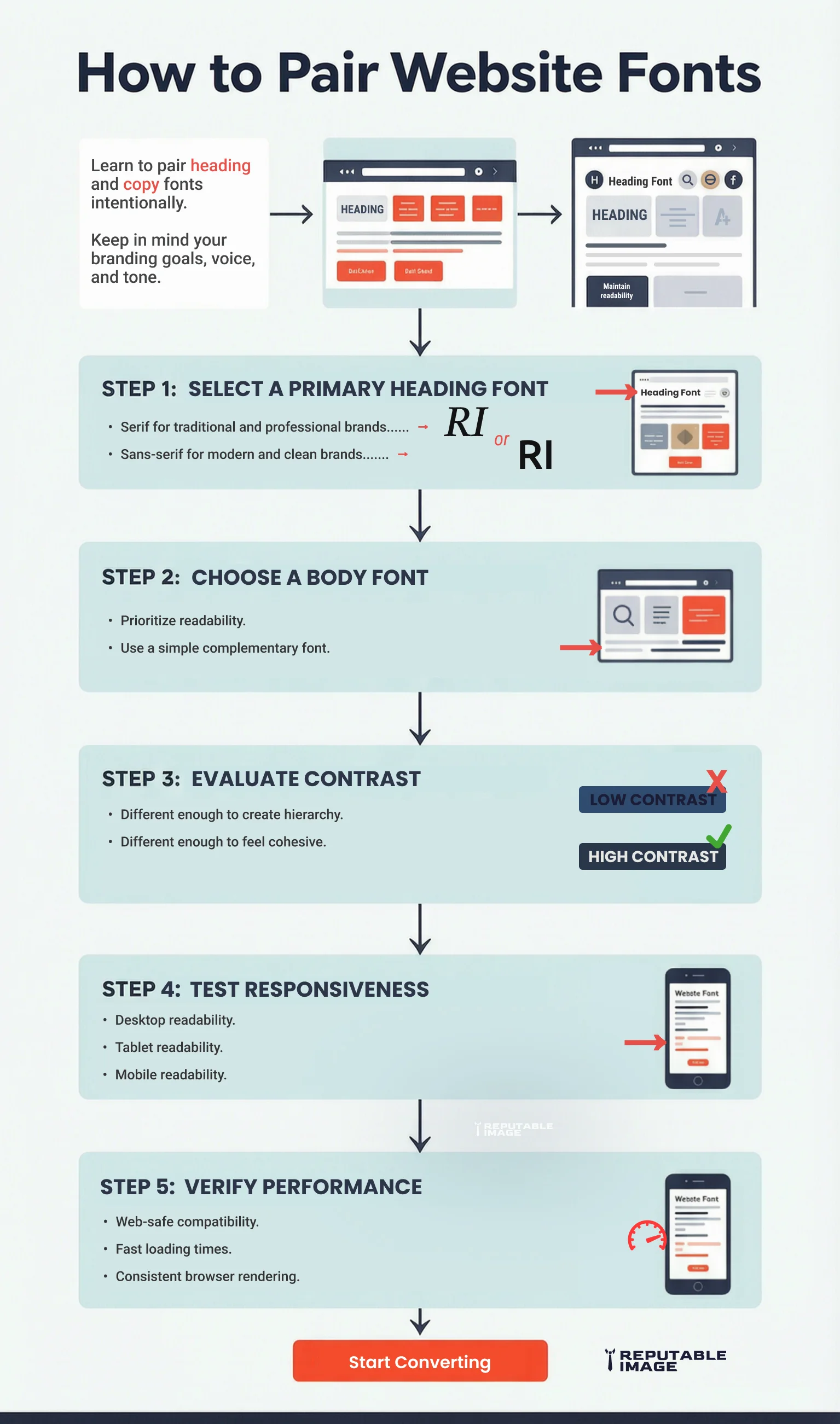
Successful pairings balance contrast and consistency. Fonts should complement each other without competing for attention. The primary principle is to pair a distinctive display typeface (used sparingly for headlines) with a highly readable neutral font for body copy. For example, pairing a bold, geometric sans-serif heading with a classic serif like Georgia for paragraphs creates a pleasing tension between modern and traditional.
Other effective strategies include:
Avoid pairing fonts that are too similar—like two humanist sans-serifs—because they can look like a mistake rather than an intentional choice. The goal is a cohesive design where the typography quietly reinforces content structure without calling attention to itself.
Font size is a critical variable in readability, and the web’s shift to mobile-first design has made it even more important. Text that is too small forces visitors to squint or zoom, causing frustration, while oversized text can break layouts and waste precious screen real estate. A well-considered typographic scale ensures comfort across every device.
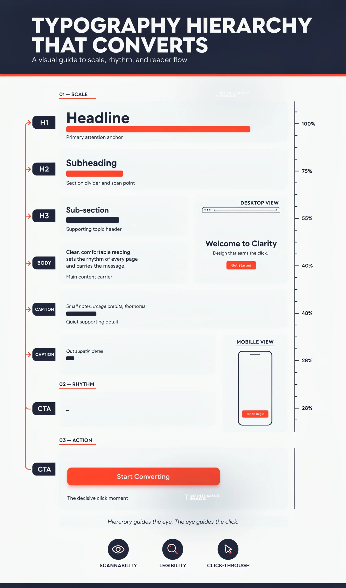
For body text, the gold standard for desktops has long been 16 pixels, but many modern websites push that to 18–20px for improved legibility on high-resolution screens. On mobile devices, a minimum of 16px is recommended to prevent iOS Safari from zooming in on form fields—a behavior that disrupts the user experience.
Headings should follow a modular scale, a sequence of sizes based on a ratio (like 1.25 or 1.333) to create a natural progression. A typical scale might be:
Responsive typography takes this further by using relative units such as rems or viewport width (vw) so that text scales smoothly between breakpoints. Media queries can adjust base font sizes for smaller screens, ensuring that headlines don’t overwhelm a smartphone screen while body text remains comfortably readable.
For example, the post title (H1 - line 1) on this post is 40px on desktop, and 28px on mobile. Each blog section header (H2) is 36px on desktop and 26px on mobile. This body text you're reading now is 18px on desktop and 14px on mobile. We periodically check our content on different screens to make sure all text is within viewport limits and eliminate any text overflow, which may happen from time to time.
Line height (leading) and paragraph spacing are equally vital. A line height of 1.4–1.6 for body text creates breathing room, while adequate space between paragraphs (around 1.5–2 times the line height) helps users track lines without getting lost. Good typography is as much about the space around letters as the letters themselves.
Web-safe fonts are typefaces that come pre-installed on most operating systems, ensuring near-identical rendering across different devices and browsers. Classic choices like Arial, Georgia, Verdana, Times New Roman, and Courier New have been staples for decades. While custom web fonts from Google Fonts or Adobe Fonts open up vast creative possibilities, they come with performance trade-offs.
Every custom font file must be downloaded before text can render, adding weight to page loads. Unoptimized delivery can trigger a “flash of invisible text” (FOIT) or a “flash of unstyled text” (FOUT), jarring experiences that degrade user perception. Web-safe system fonts, on the other hand, load instantly because they already reside on the user’s machine.
Modern development practices offer a middle ground: font-display: swap in CSS allows fallback text to appear immediately, then swaps to the custom font once it loads. Subsetting fonts to include only the characters you need, converting to WOFF2 format, and hosting files on a CDN can dramatically reduce performance penalties.
The performance argument for system fonts is compelling. A 2021 study found that using a system font stack (like -apple-system, BlinkMacSystemFont, “Segoe UI”, Roboto, etc.) reduced page weight by up to 200 KB compared to a custom Google Fonts setup. Faster load times directly improve Core Web Vitals, which in turn can boost SEO rankings. Typography choices, therefore, sit at the intersection of design, branding, and technical SEO.
Typography directly influences how users interact with calls to action, product descriptions, and key conversion elements. Clear, scannable headings make it easier for visitors to find what they need. Readable body text reduces cognitive load and keeps users engaged. Well-designed CTA buttons with appropriate font weight, color contrast, and size draw the eye and encourage clicks. To improve overall user experience, read UI/UX Best Practices.
Small improvements can yield measurable results. Eye-tracking studies consistently show that users scan web pages in an F-shaped pattern, gravitating toward headings, subheadings, and bulleted lists. If those elements are set in a muddy, ambiguous typeface or sized too similarly to body copy, the scannability plummets. In contrast, a strong sans-serif heading that clearly differentiates itself from the text below invites the eye to jump in and out of content.
Color contrast is also a typographic conversion lever. WCAG 2.1 guidelines recommend a contrast ratio of at least 4.5:1 for normal text and 3:1 for large text. Links and buttons that meet these standards are more likely to be noticed and clicked. A well-chosen accent color for hyperlinks, coupled with an underline or bold weight, transforms words into actionable paths.
Even microcopy falls under the typographic umbrella. The font choice for your checkout button or lead form can alter perceived urgency and trust. A rounded, friendly typeface on a “Get Started” button might work well for a creative brand, while a clean, authoritative sans-serif on a “Request a Quote” button signals professionalism. Every letter contributes to the overall narrative.
Consistency is the unsung hero of website typography. Without documented standards, design drift sets in: one page uses 18px headings, another 22px; a blog post switches fonts on a whim; marketing emails ignore the visual language of the site entirely. This fragmentation dilutes brand recognition and confuses users.
A typography system solves this by defining the styles for every text element: headings H1 through H6, body text, blockquotes, captions, button text, and navigational items. It specifies font families, weights, sizes, line heights, letter spacing, and color for each—in both desktop and mobile views. This creates a single SOT (source of truth) that designers, developers, and content creators can follow. To build a stronger visual identity, read Brand Style Guide: Fonts & Tone
Beyond maintaining visual unity, a typography system accelerates content production. Writers can apply pre-established classes rather than make arbitrary design decisions. Developers can translate the system into reusable CSS variables or design tokens, making global updates trivial. And when a business rebrands, changes cascade from a few centralized definitions.
To implement a typography system, start with an audit of all current text styles. Consolidate where inconsistencies exist. Choose a modular scale and define a limited number of weights and styles. Document the rationale (e.g., “Our brand is modern and approachable, so we use the geometric sans-serif Poppins for headings and the highly readable Inter for body text”). Sharing this guide with every team member ensures that typography remains an asset, not an afterthought.
Typography is far more than a decorative layer; it is a foundational element of website usability, branding, and conversion optimization. From strategic font pairing and responsive sizing to performance-conscious font loading and conversion-focused hierarchy, every typographic decision shapes how users perceive and interact with a business online. Companies that invest in thoughtful typography create websites that are easier to navigate, more trustworthy, and ultimately more effective at turning visitors into customers.
At Reputable Image, we help businesses create websites that combine strong design with seamless user experiences. If you’re ready to improve readability, strengthen your brand, and increase conversions through refined typography and comprehensive SEO strategies, click below to Call for SEO help and get started.
Sources:
1. Google Font Knowledge Library - "Using variable fonts on the web"
https://fonts.google.com/knowledge/using_variable_fonts_on_the_web
2. Page Laubheimer at Nielsen Norman Group (NNGroup) - "Typography for Glanceable Reading: Bigger Is Better"
https://www.nngroup.com/articles/glanceable-fonts/
