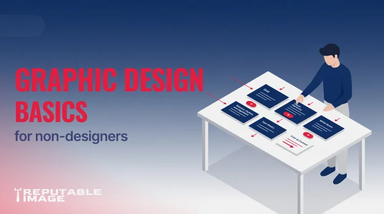
Good graphic design basics make your content easier to read and more persuasive — without spending hours or hiring a designer. This guide gives simple, repeatable rules for layouts, visual hierarchy, and whitespace so non-designers can produce clean, professional pages and posts.
Before you open a layout tool, ask: what does the viewer need to do — read, click, remember, or share? Designing with that single purpose in mind keeps your choices focused and prevents “feature creep” in layouts.
Use a simple grid to align elements consistently — a 12-column grid for flexible web content or a 6-column for social/shop assets works well. Grids aren’t constraints; they’re speed tools: once you commit to column widths and gutters, decisions about spacing and alignment disappear. Consistent grids make multi-person teams produce visually coherent work without micromanaging every post.
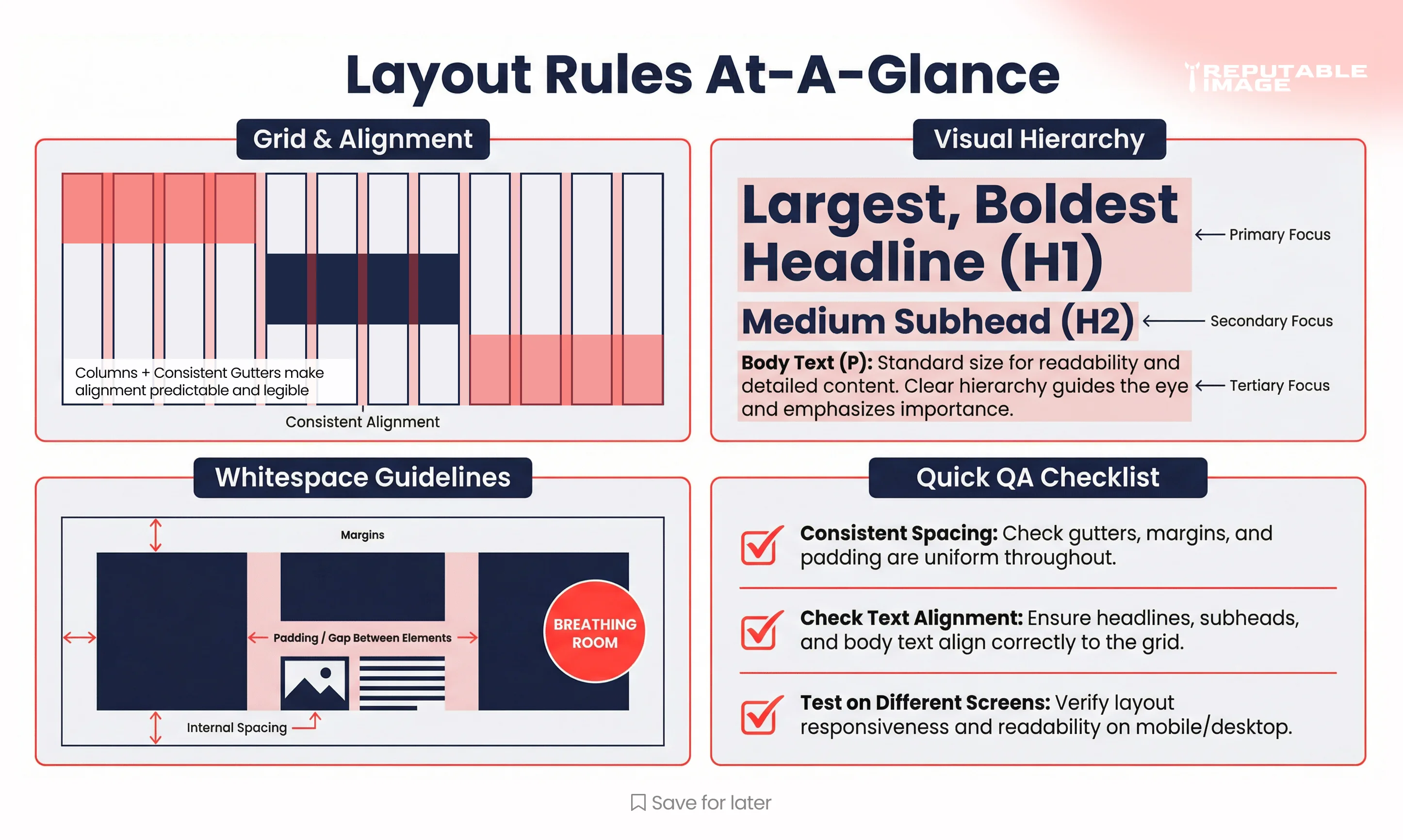
Hierarchy answers the question: what should I look at first? Use size, weight, color contrast, and placement to create a clear order — headline (big, bold), subhead (smaller), body copy (comfortable reading size), and CTA (visually distinct). A practical trick: if two items fight for attention, reduce the importance of the less-important one.
Whitespace (or negative space) gives your content room to breathe and helps highlight what matters. Use larger margins around key elements and slightly tighter spacing within grouped items so readers understand relationships quickly. Don’t fear empty space — it often increases perceived professionalism and focus.
Balance is about visual weight: a large image on the left can be balanced by several small text blocks on the right. Rhythm is repeating spacing or visual motifs to create predictable scans. Always align elements to a grid line — misalignment is a quick way to make even good content feel amateurish.
Limit palettes to 2–3 core brand colors plus neutrals; this prevents noisy compositions. Reserve saturated color for CTAs and key highlights, and ensure text contrast meets legibility needs (dark text on light backgrounds or vice versa). For non-designers: a neutral background, one headline color, and one accent color covers most needs.
Choose one display font for headlines and one readable sans-serif for body text — don’t mix more than two families. Set a clear typographic scale (H1, H2, H3, body, caption) and stick to prescribed sizes to avoid visual chaos. Line length and leading matter: aim for 50–75 characters per line and 1.4–1.6 line-height for comfortable reading. For export and logo scaling tips relevant to templates, see How To Design A Logo That Scales.
Create small, repeatable components: hero block, three-card row, quote block, and CTA banner. Build one version and reuse it — consistency beats endless tweaking. Export components as templates (Figma/Canva) so non-designers can swap copy and images safely.
Before publishing, run a short checklist: Is the headline the most obvious element? Is there one clear CTA? Can your layout survive common crops (mobile, square)? This 60-second review fixes 80% of small design issues.
Check text contrast and avoid tiny fonts for body content; include alt text for images. Accessibility isn’t optional — it expands your audience and protects your brand.
Use template-friendly tools (Canva, Figma templates, or preset Slides) that lock layout while letting you change copy and images. Keep a shared asset folder with approved colors, fonts, and logo lockups so everyone pulls from the same resources. A single “style cheat sheet” file saves endless back-and-forth. To measure how layout changes affect user behavior on your site, see Using Analytics to Improve UX.
A client replaced free-form social posts with three standard templates and one weekly QA pass; within one month their on-post engagement rose 22% — mostly because CTAs and hooks were consistent. Small, systems-based changes compound quickly.
Mastering a few graphic design basics — grids, hierarchy, and whitespace — gives non-designers a toolkit to produce better work faster. Start with simple templates, run the quick QA, and iterate from results.
If you want templates, a starter cheat sheet, or a short training session to get your team up to speed, Reputable Image can build a practical, branded toolkit and teach your staff how to use it.
Sources:
1. Sara Gibbons at Nielsen Norman Group - "Visual Design & Layout"
https://www.nngroup.com/articles/why-does-design-look-good
2. Steven Bradley at Smashing Magazine - "Design Principles: Visual Weight and Direction"
https://www.smashingmagazine.com/2014/12/design-principles-visual-weight-direction
