A logo that scales reliably is one of the most practical brand assets a small business can own. A well-built logo stays crisp from a tiny app icon to a billboard, reduces rework, and keeps your identity consistent across channels. This post covers file formats, clearspace rules, and lockup systems so you can design with confidence and hand off tidy assets to partners and printers.
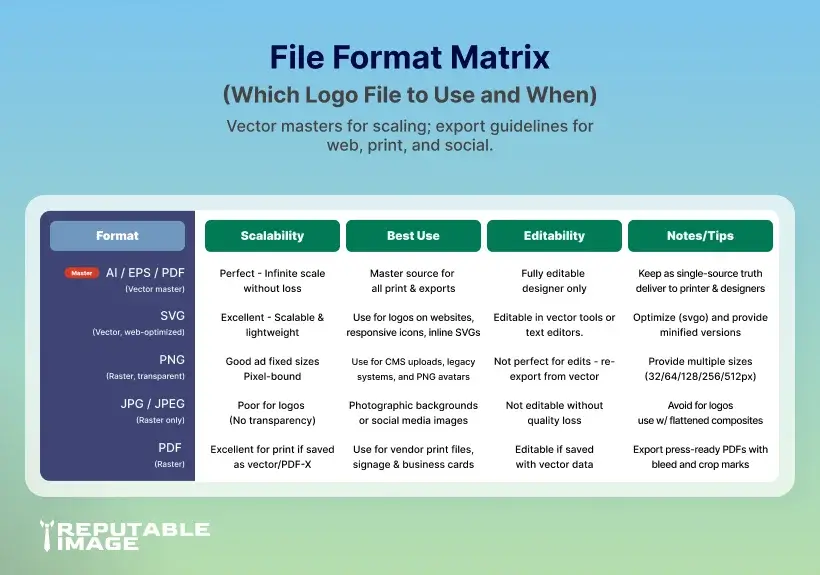
Logos should be mastered as vector files (AI, EPS, PDF, SVG) because vectors use mathematical paths that stay sharp at any size. Vector masters let you export pixel-perfect assets for print and web without re-drawing the mark; for web, SVG is ideal because it’s lightweight and responsive. These differences are foundational to producing a logo that scales.
(Adobe)
For a complete site-ready asset checklist, see Web Design & Hosting: Complete Small Biz Guide.

Always deliver a package: master AI (or PDF/EPS), an optimized SVG for the web, PNGs (transparent) at small/medium/large, and a high-res JPG or PDF for print. For social avatars include a square PNG and an icon-only SVG. Keeping a standardized export set avoids last-minute asset requests and poor-sized logos in the wild. (Stoke Design)
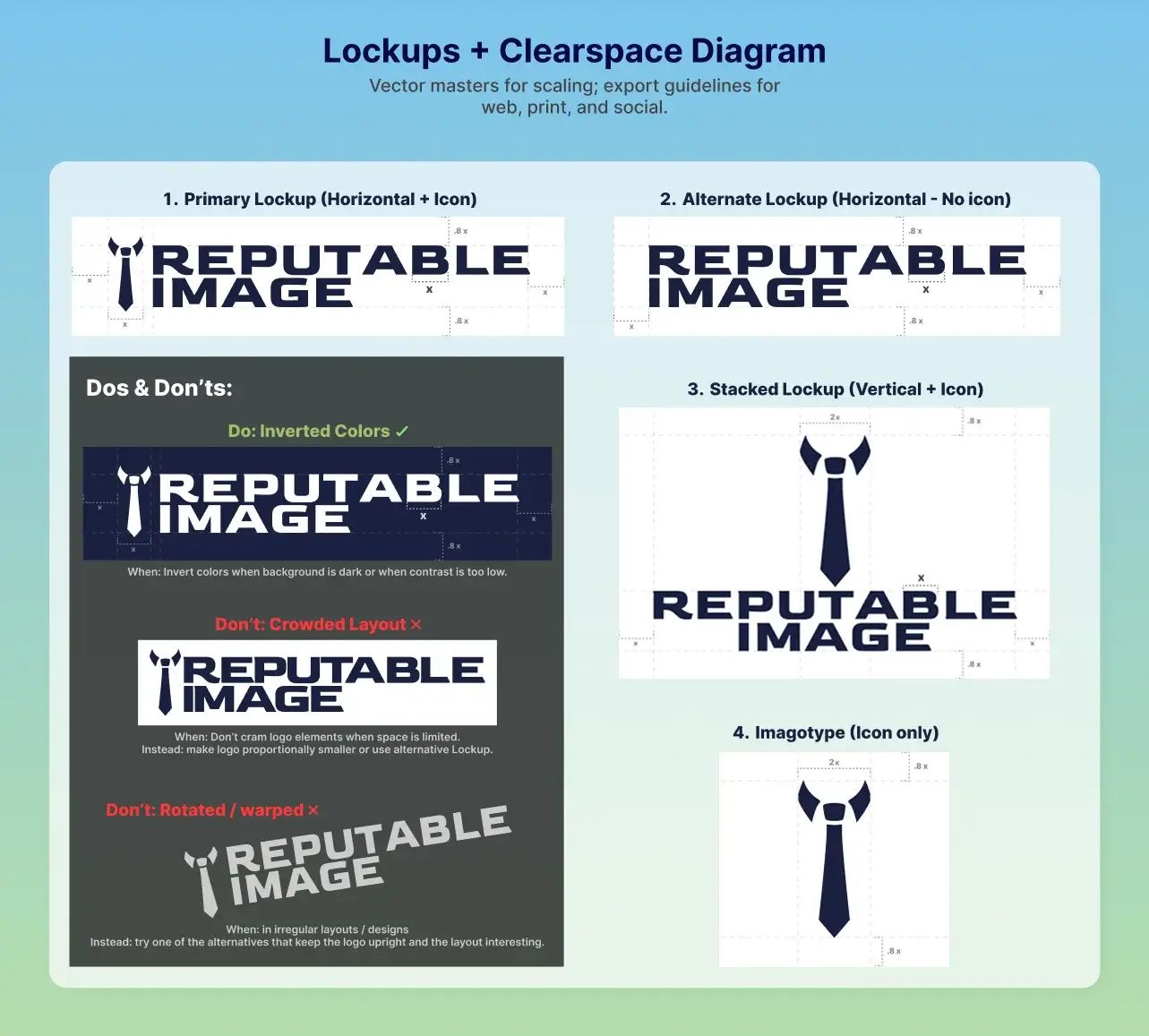
Clearspace is the invisible margin around your logo that protects legibility and impact. Establish clearspace using a proportional measure (for example, “x = height of the logomark” or “x = cap-height of the wordmark”) and show it in your guidelines so others respect it. Clearspace prevents layout clutter and ensures the logo reads correctly at smaller sizes. (UC Davis)
Along with clearspace, define minimum reproduction sizes for each variant (primary, stacked, icon-only). A typical guideline: a horizontal wordmark might have a 24–30 px web minimum, while an icon-only mark can be usable at 16–20 px if simplified. Test real use cases (favicons, mobile nav, printed pens) and raise the minimum until legibility is uncompromised. (UC Davis)
A lockup is the arrangement of logomark, logotype, and tagline. Provide clear primary and alternate lockups: horizontal, stacked, and icon-only. Always preserve relative spacing and proportions and avoid ad-hoc tinkering. Your design system should show when to use each lockup (e.g., horizontal for website headers, stacked for print, icon-only for avatars). This system is critical so the logo scales sensibly across formats.
(brightscout.com)
Want brand guideline templates and examples? Check A Guide To Effective Design.
Logos with clean shapes and bold forms scale more effectively than those with fine detail or long gradients. Simplify ornamental detail for small sizes — consider a simplified or single-color version for tiny applications. Test your logo in one-color and single-stroke variants to ensure it remains recognizable and retains brand voice when display constraints require it. (brightscout.com)
When the logo appears on images or colored backgrounds, ensure contrast meets readability targets. Keep a one-color (white/black) version for high-contrast swaps, and supply a reversed mark for dark backgrounds. Accessibility-conscious choices keep your logo readable to all users and avoid accidental low-contrast deployments.

Provide a predictable folder like:
/brand/LOGO/ → master.ai, logo_primary.svg, logo_icon.svg, logo_primary@2x.png, logo_square.png, logo_print.pdf, brand-guidelines.pdf.
Clear naming speeds teammate handoffs and prevents multiple conflicting assets.
A logo that scales reduces vendor friction, speeds up production of marketing materials, and prevents brand inconsistency that confuses customers. When your mark behaves across channels, your team looks professional, save design hours, and protects recognition as you grow. The cost of a proper logo package is small compared to repeated reworks and lost polish.
Designing a scalable logo is an investment in clarity and efficiency — it reduces headaches across marketing, development, and print. A disciplined approach (vector master, clearspace, lockups, and export sets) ensures your brand performs anywhere it appears.
If you’d rather hand this to experts, Reputable Image designs logos that scale, creates complete brand asset kits, and delivers tidy guidelines so your team (and partners) always use your identity correctly.
Sources:
1. Adobe - "Raster vs. vector: Which one should you use for your projects."
https://www.adobe.com/in/creativecloud/roc/blog/design/should-you-use-raster-or-vector-for-your-projects.html
2. Marnie Hines at Stoke Design - "Understanding Logo File Types: A Comprehensive Guide"
https://stokedesign.co/understanding-logo-file-types-a-comprehensive-guide
3. UC Davis - "Can a Domain Name Boost SEO Rankings?"
https://health.ucdavis.edu/graphicstandards/pdf/spacing_clearspace_guide.pdf
4. Victoria Government - "Branding and logos - digital guide"
https://www.vic.gov.au/branding-and-logos
5. Google Search Central - "What are the best practices for logo design and visual identity creation?"
https://www.brightscout.com/insight/best-practices-for-logo-design-and-visual-identity-creation