
Mobile-first design puts the smallest screen — a phone — at the center of your decisions so every interaction is clear, fast, and frictionless. This approach forces disciplined prioritization: what the user needs right now, above the fold, with tappable targets and fast-loading assets. When done well, mobile-first design increases engagement, reduces bounce, and raises conversions for visitors who are often on slow networks or interrupted sessions.
Start by defining the page’s core action on mobile: sign up, buy, call, or read. Design around that single goal and remove anything that competes for attention; every pixel should support the primary action. A clear content hierarchy — strong heading, lead benefit sentence, and a single CTA — helps users decide in seconds.
Use a one-column fluid grid for small screens and scale up to multi-column layouts for tablets and desktops. The mobile grid encourages vertical rhythm, consistent gutters, and repeatable components so content stacks predictably. Make spacing token-driven (8 / 16 / 24) so components scale cleanly across breakpoints. To align mobile layouts with broader UI patterns, see UI/UX Best Practices.
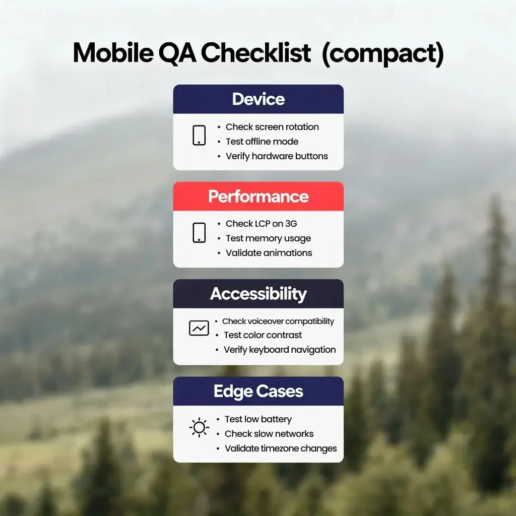
Testing Checklist
— Device and Layout Checks
Increase body sizes slightly for mobile (16px+ recommended) and set readable line-height (1.4–1.6). Limit headline lines to 1–2 on narrow screens; truncate gracefully with ellipses or progressive disclosure for longer content. Keep font weights consistent — avoid many type styles that create visual noise on small displays.
Design tappable areas at least 44×44 CSS pixels and give clickable elements generous padding so users don’t mis-tap. Leave clear spacing between adjacent actions (e.g., primary CTA vs. secondary link) and avoid placing important actions near the phone’s edges where accidental touches occur. For long pages, consider sticky CTAs or an in-screen floating action to reduce scrolling friction.
Serve responsive images (srcset) and modern formats (WebP/AVIF) with sensible fallbacks. Use lazy-loading for below-the-fold media and prioritize visible images with preload hints. For decorative imagery, consider CSS backgrounds or SVG icons to reduce bitmap weight; for product photos, provide multiple resolutions and crop-safe guidelines.
On mobile keep navigation minimal: a compact primary menu, a search affordance, and clear back patterns. Use progressive disclosure (hamburger or bottom nav) for secondary items but keep important actions in the visible chrome. Breadcrumbs are less prominent on phones — instead, provide clear headings and contextual links inside content.
Simplify forms: request only necessary fields and prefer single-column layouts with large inputs. Use input types that trigger platform keyboards (tel, email, numeric) and add auto-complete attributes to speed completion. Validate inline and show clear success/error states so users can correct issues without losing entered data.
Testing Checklist
— Edge cases & real-world flows
Mobile users often have limited bandwidth and CPU. Measure and optimize Largest Contentful Paint (LCP), First Input Delay (FID) or Interaction to Next Paint (INP), and Cumulative Layout Shift (CLS). Minimize main-thread work, defer noncritical scripts, and compress assets. Tools like Lighthouse and WebPageTest make it easy to track regressions and prioritize wins.
Testing Checklist
— Performance
For help measuring UX and behavior after mobile changes, see Using Analytics to Improve UX.
Ensure color contrast meets WCAG AA for body text and that interactive elements are reachable and keyboard-operable. Provide descriptive alt text for images and ARIA roles for dynamic components. Inclusive design benefits everyone — better readability, easier navigation, and broader reach for your content.
Testing Checklist
— Accessibility & Input
Designing is only half the job — rigorous testing discovers real-world problems. Below is a compact checklist you can use during QA: it covers device testing, performance, accessibility, and edge-case flows. Use this checklist in staging as part of your release pipeline before a public push.
Combine emulators with a small set of real devices to cover common OS/browser combinations. Use remote device labs (BrowserStack) for wider coverage and Lighthouse CI in your pipeline to prevent regressions. Adopt a short checklist for product owners to run before sign-off and keep issues prioritized by impact (conversion impact first).
After launch, monitor mobile behavior with analytics: mobile bounce rate, conversion funnel completion, session length, and engagement by device class. Combine real-user monitoring (RUM) data with synthetic tests to spot regressions early. Use A/B tests to validate layout changes or CTA placements rather than guessing.
Mobile-first design is discipline: prioritize core actions, optimize for speed and touch, and test thoroughly on real devices. Small teams that bake performance and testing into their process ship faster and deliver happier mobile users.
If you’d like help auditing your mobile experience, implementing performance fixes, or building a repeatable mobile QA workflow, we can set it up and run a prioritized action plan. Click the button below to call us for a free consultation and we’ll map the highest-impact fixes for your site.
Sources:
1. Google Policy at Google Search Central - "General structured data guidelines"
https://developers.google.com/search/docs/appearance/structured-data/sd-policies
2. Schema.org - "FAQPage"
https://schema.org/FAQPage
3. Rob Timmermann at Timmermann Group - "Schema Markup: The Complete Guide 2026"
https://www.wearetg.com/blog/schema-markup
